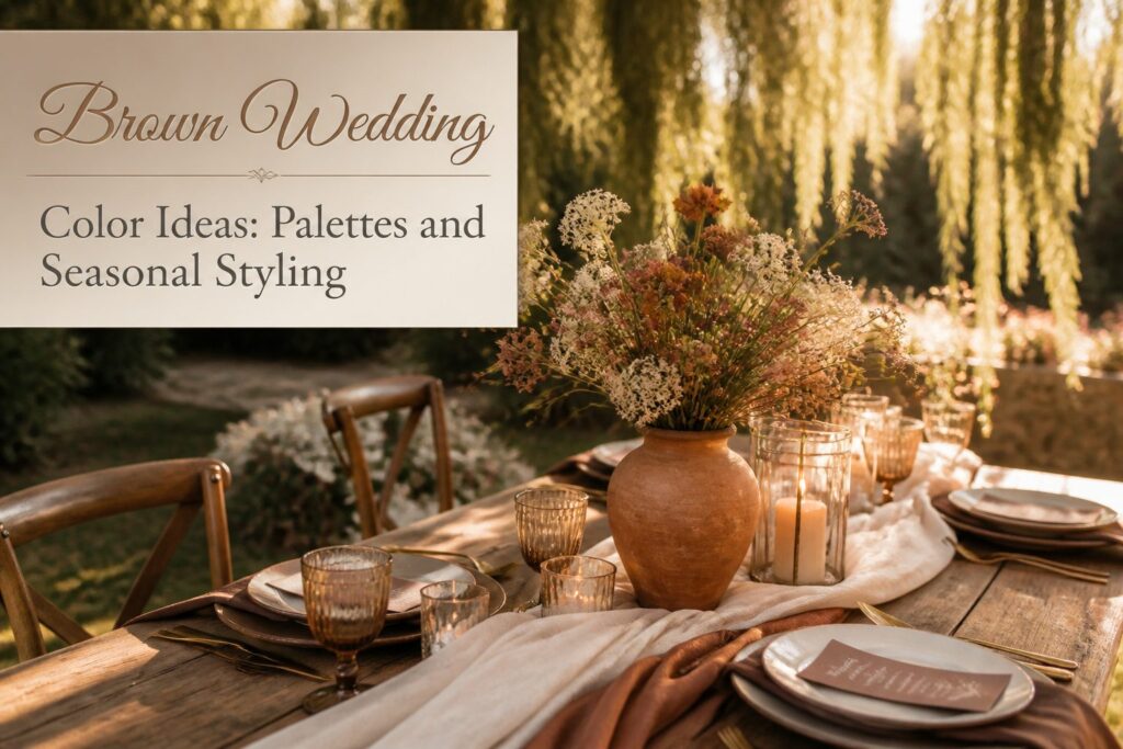
A brown wedding color palette is a warm neutral that photographs steadily across natural light and flash without shifting with each season’s editing style.
What makes it work is the undertone: pair warm chocolate with terracotta and cream, or cool taupe with dusty blue and slate, but never mix the two or the room goes flat.
Mocha Mousse (#A2765F) has become the particular shade that convinces hesitant bridesmaids, reading sophisticated in natural light rather than heavy or unfinished.
[link-whisper-related-posts]Why Brown Came Back
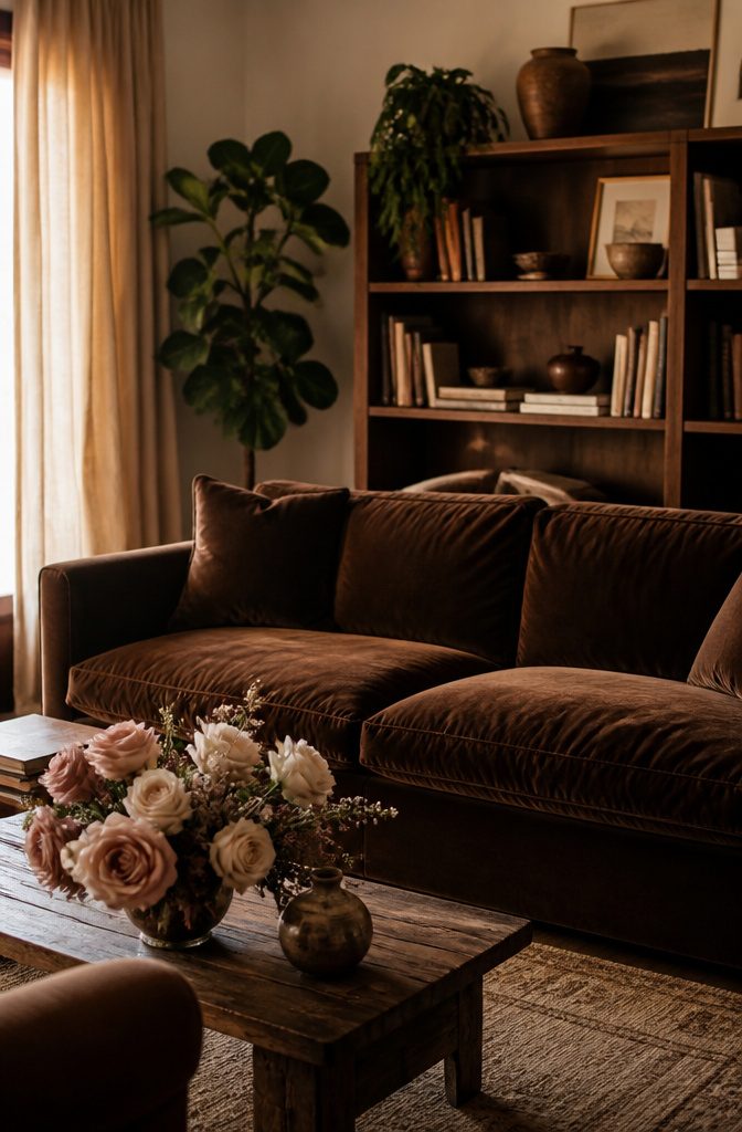
Brown spent decades tied to shag carpet and harvest-gold appliances, the color of a 1970s den nobody wanted to recreate.
That association kept it off wedding palettes even as beige and blush took over, because couples planning a day they will look at for fifty years do not gamble on trends that might sour.
The shift started in fashion and interiors, where chocolate brown and mocha tones returned as deeper, more saturated alternatives to the safe neutrals that had flattened everything out.
Couples noticed. A brown wedding color palette offers warmth without demanding attention the way jewel tones do, and it photographs steadily across natural light and flash rather than shifting with each season’s editing style.
Brown will not timestamp your wedding photos the way a trendy pastel might. Like black or white, it functions as a natural neutral.
The question of whether it will look dated in ten years answers itself once you stop pairing it with period-specific accents; the color alone carries no era the way avocado green carries 1974.
What changed is not brown itself but the desire behind it.
After years of pastel perfection and bright, polished palettes, couples are choosing colors that feel lived-in from the first photograph. Brown delivers that without the performance of rustic kitsch.
Dark Chocolate
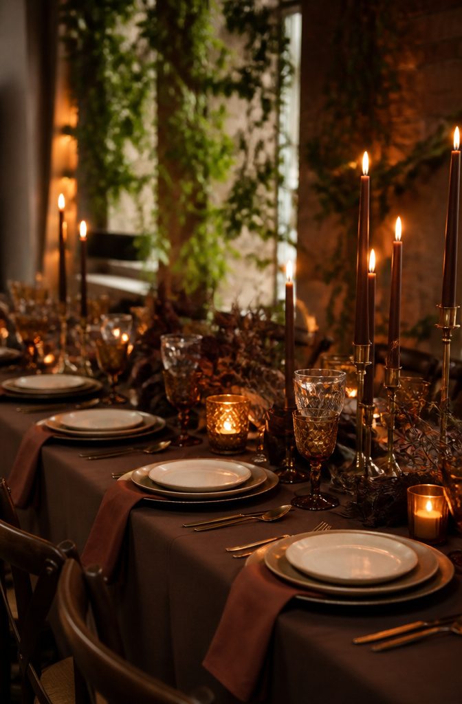
Dark chocolate sits at the deepest edge of brown, a shade that reads almost black in dim light and warms to something richer when the candles come up.
For fall and winter weddings, that depth is the point: it absorbs the season’s weak daylight and gives it back as drama.
The color flatters most skin tones in bridesmaid dresses, which is why chocolate and mocha tones have been taking over bridal parties.
A silky slip dress or velvet gown in this range avoids the usual pastel trap and lets each attendant read as herself rather than as decoration.
The pairing options are straightforward and forgiving. Cream keeps it from turning funereal; gold adds the metallic warmth that dark chocolate needs to feel celebratory rather than somber.
Blush works too, though the contrast is softer, more whispered than declared. For table settings, dark wood chargers layered with mocha napkins and matte ceramic plates in ivory or amber build the palette without shouting it.
Gold cutlery and brown taper candles finish the look, tapping into the 2025 "Earthy Neutrals" Pinterest trend with actual texture rather than trend-board aspiration.
A chocolate-dripped cake is the move here if you want the color to carry through to dessert, the ganache oozing down tiers in a way that feels intentional rather than accidental.

Rock My World - Rock on with 9 warm, earthy terracottas, neutrals and bronzes in Matte, Metallic and Matte Sparkle finishes! Get all the warm, rich shades you need in one...
Mocha Mousse
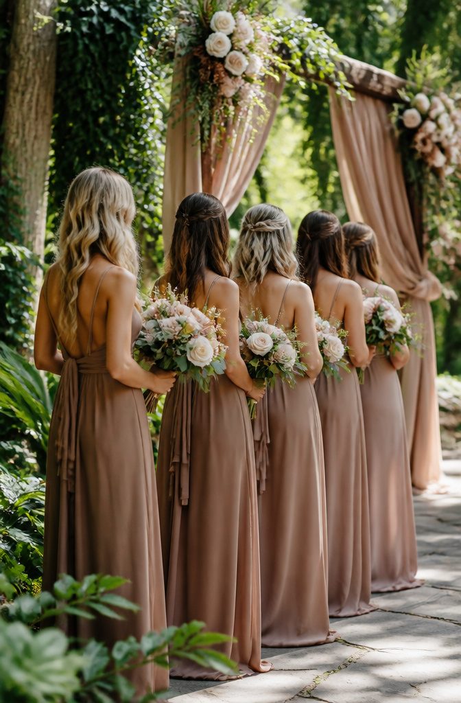
Mocha Mousse (#A2765F) lands in that rare middle ground: warm enough to glow against every skin tone, muted enough to feel intentional rather than accidental.
I have watched brides hesitate over brown bridesmaid dresses until they see this particular shade in natural light; it reads as sophisticated where darker browns can read heavy, and as grounded where lighter tans read unfinished.
The real strength is how it moves across seasons. In spring and summer, Mocha Mousse holds its own against bright florals and outdoor greens without the harsh contrast of black or the over-familiarity of navy.
It photographs with subtle depth instead of flattening into a dark blob or washing out in sun.
For a bridal party, this color solves the coordination problem that black creates with outdoor ceremonies and the formality problem that pastels create with evening receptions.
Groomsmen in Mocha Mousse suits, perhaps with a tie one shade deeper for texture, step away from the rental-standard navy without drifting into costume territory.
Bridesmaids in this tone gain a neutral that actually works with the mixed metallics most women already own for shoes and jewelry.
The tonal approach works here too: pairing Mocha Mousse with slightly lighter Iced Latte accents or deeper Brown Velvet details builds dimension without introducing competing colors.
Cinnamon Bark
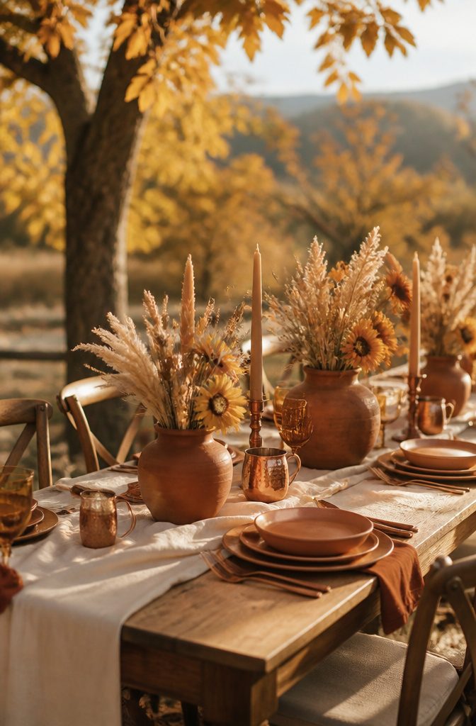
Cinnamon Bark (#A24E2C) sits at the rust end of brown, where the color starts leaning into something almost brick but stops short.
That spicy red undertone is what saves it from reading as dull earth; instead it catches late-afternoon light the way actual bark does on a tree in October.
Autumn weddings are where this shade earns its keep, pairing naturally with the season’s existing palette of dried grasses and turning leaves rather than fighting against it.
The trick with Cinnamon Bark is keeping the surrounding colors in the same warm family so nothing goes muddy. Terracotta works because it shares that red pulse, just dialed a half-step brighter.
Cream, not stark white, keeps the whole arrangement from turning into a rusted-out tractor; the warmth in a true cream echoes back to the brown rather than contrasting against it.
I have seen this combination go wrong once, when a couple introduced a cool slate gray that flattened the Cinnamon Bark into something resembling wet cardboard.
The undertone rule holds: warm browns want warm partners. Ochre, camel, or even a quiet chrome metallic finish the thought without shouting.
Iced Latte
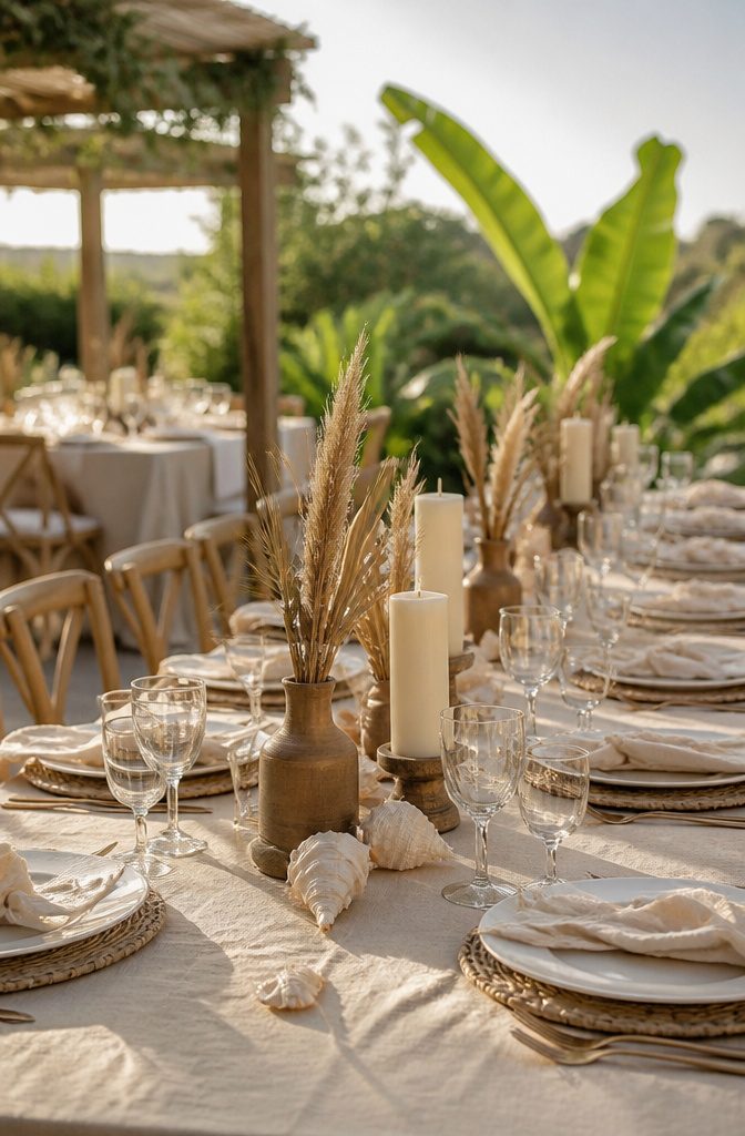
Iced Latte (#D5C2B3) sits at the lightest end of the brown spectrum, a creamy wash that reads more as warmed ivory than true brown.
Pair it with bleached shells and linen napkins for a beach wedding and the effect is airy enough to feel coastal without drifting into generic seaside territory.
The source material calls this Santorini café vibes, which tracks: the palette borrows from sun-bleached wood and dried grasses rather than the usual navy-and-coral playbook.
For spring receptions, the shade solves a specific problem.
Most browns arrive heavy, weighted toward fall and winter moods. Iced Latte flips that, carrying just enough pigment to register as intentional color while staying light enough for daytime.
The risk is going too pale and losing the brown entirely, so the shell and linen accents matter. They add texture that reminds guests this is a considered palette, not a default neutral.
Daytime events are where this color earns its place.
Under natural light, it photographs warm without yellowing, and against greenery it softens rather than competes. The same lightness that makes it work for spring also limits it: come evening, under artificial light, the color can flatten toward beige.
If the reception runs past sunset, plan the shift with candles or amber bulbs rather than fighting the fade.

Elegant Accent: This dark brown candlestick holder brings a refined vintage look to your table, adding a warm decorative touch without overpowering the rest of your decor. Its single-head design creates a simple, polished focal point for everyday styling or special moments
Light Brown
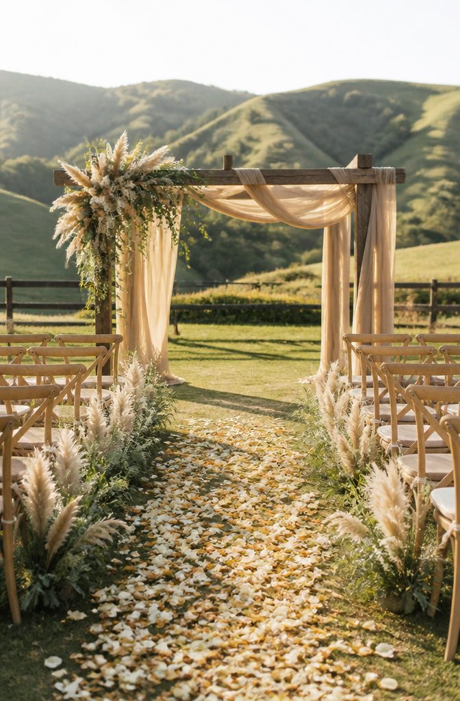
Light brown reads as the most approachable entry point into this color family, soft enough to feel like a neutral without washing out into beige.
Pair it with sage green and cream for a palette that feels gently pulled from nature, the kind of combination that works particularly well for spring and summer weddings when the surrounding landscape already carries those tones.
The real advantage here is texture over exact matching.
Mixing different shades of light brown and cream, say a latte pocket square against a lighter tan suit, gives the bridal party a pulled-together look without the stress of hunting down identical dyes.
For spring and summer couples, this matters because the brighter natural light will show up any harsh contrast; the softness of light brown keeps everything in the same tonal breath.
Sage adds the living element.
Bridesmaids in light brown or ivory dresses holding dried or fresh greenery bouquets, groomsmen in those tan suits with sage boutonnieres, wood vases and pampas grass at the reception: the palette builds itself outward from those three anchors.
Copper can warm it further if you want more depth, but the three-core combination stands on its own.

Stain resistant: Specially-treated fabric resists discoloration and is stain-resistant. Ideal for entertaining and kid-friendly, any spilled liquid beads up for easy cleaning.

Expertly sewn hemmed edges: Finished with clean, straight hems for a tailored, polished look, these tablecloths are designed to lay flat and drape smoothly across the table. Reinforced edging helps maintain shape and structure through repeated use and washing, delivering a crisp appearance for everyday dining, gatherings, weddings, and special occasions.

IMPRESS YOUR GUESTS – Our satin rectangular tablecloths will help you to create a sophisticated and unique look for your event. Our satin fabric is one of the highest quality you can find.
Chocolate Brown
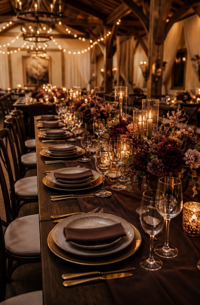
Chocolate brown carries a warmth that darker, cooler shades like dark chocolate lack, making it the more approachable of the two for couples who want richness without severity.
I see it most often in groomsmen suits, where the color flatters a wide range of skin tones and pairs easily with nearly any shirt, tie, or boutonniere combination.
Table linens in this shade work the same way: mocha-tone napkins against dark wood chargers create a layered, romantic tablescape that taps into the earthy neutrals trend without trying too hard.
For the cake, chocolate brown functions as a thematic staple rather than an accent.
A naked chocolate cake with ganache layers, caramel drip, and fresh figs makes the color part of the dessert itself, not just the frosting. Brownies or chocolate chip cookies alongside it keep the mood consistent and guests fed.
Taupe
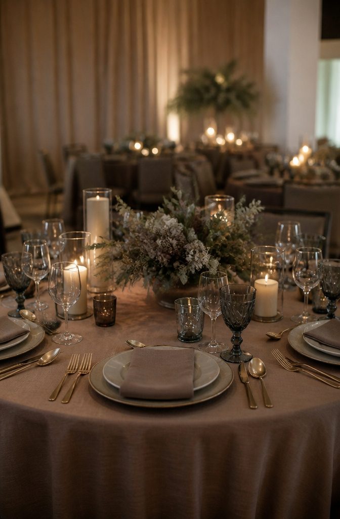
Taupe sits at the gray edge of the brown family, and that coolness is exactly what makes it tricky.
Pair it with warm terracotta or ochre and everything in the room goes slightly out of tune, like a photograph with the white balance off.
Stick to cool companions: navy, sage, slate, mauve, dusty blue. The undertone match matters more than the specific shade.
For that reason, taupe reads as the most formal brown. It carries the warmth of earth without the rustic informality, which makes it suited to evening ceremonies and black-tie-adjacent dress codes where mocha or cinnamon would feel too casual.
I have watched linen-draped tables in pale taupe turn quietly elegant under candlelight in a way that darker espresso browns sometimes crush under their own weight.
The same coolness can flatten under cold venue lighting though, the kind that turns every skin tone sallow. Budget for warmth there, literally: candles, warm LEDs, anything that keeps the gray from slipping toward mud.

Luxuriously Satin Feel: Silky-smooth with a soft, subtle and gorgeous shine; breathable and lightweight with a strong, non-stretch hand for all-day comfort. Not see-through, resists static and wrinkles for a polished satin shirt/silk blouse look—made to be your 365-day staple, from Fall summer solo to layered in fall and winter

【Unique Design】: Arch wedding decoration is a new trend, minimalism will never go out of style. We love the clean lines of these arch acrylic wedding signs! This wedding sign will be the perfect addition to any rustic, vintage, country, garden or woodland themed wedding.

【Exquisite design】:This bride bridesmaid bouquet contains champagne roses, white hydrangeas, lavenders, gypsophila, rose leaves, frosty green eucalyptus leaves, ribbons and jute rope. Artificial bridal bouquets are handmade, simple and elegant, bright and comfortable colors, ideal for your wedding decoration.
Brown in Wedding Attire
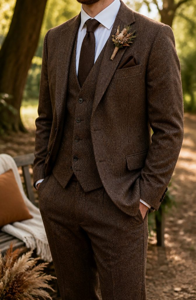
Chocolate brown or tweed suits have become a refined, fashion-forward choice for couples who want something warmer than the standard navy or black.
The color flatters a wide range of skin tones and works with nearly any shirt, tie, or boutonniere combination you throw at it.
For summer, a light linen brown suit keeps things breathable; for autumn, deep wool adds the weight the season calls for.
Bridesmaids in mocha or chocolate dresses carry the palette without looking like they’re matching furniture. The tone photographs softly and pairs well with both warm metallics and ivory bouquets.
Brown suede shoes and a mocha tie add texture without competing for attention. Belts should match the shoe leather, not fight it.
For jewelry, understated pieces in brushed gold or warm copper keep the look grounded. If your party wants variation, suits in different shades of brown give a coordinated effect that still feels effortless rather than uniform.

Size Tips: Crafted from soft flowy chiffon fabric for a comfortable fit. Please carefully review the size chart before ordering to select your correct size

☆Multiple Ways to Wear☆ Our pashmina shawls offer generous coverage, draping over your shoulders to provide warmth and comfort. Whether you need to stay cozy during a cool evening or simply want to add a stylish layer to your outfit. Wear in a variety of styles: long, knotted, looped, twisted, capes, poncho, wrap, pashmina or doubled around the neck. Measures approximately 74” x 29” including fringe 3.5”. Made from 100% Viscose – even if the tag says otherwise.

TOP CHOICE: Women's Casual Deep- V Neck Sleeveless Vintage Wedding Maxi Dress.Women lady sexy convertible multi way wrap dress plus size full length long maxi dress wedding bridesmaid party formal bandage off shoulder slim fit V neck cocktail homecoming evening gown ;
Brown-Friendly Flowers
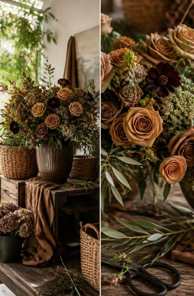
Toffee roses and chocolate cosmos are the two flowers that make a brown palette feel intentional rather than accidental.
The toffee roses carry that warm caramel tone without drifting into orange, and chocolate cosmos actually carries a cocoa scent, which is a small detail guests tend to remember.
For greenery, stick to olive and sage tones and skip anything with a neon cast or that silvery blue eucalyptus that reads cold against brown.
The mistake I see most often is reaching for rustic fillers, the kind of loose, weedy greenery that turns a sophisticated brown arrangement into something that belongs at a barn sale.
Olive branches give the same organic feel but keep the look intentional, almost Mediterranean.
Sage works softer, for bouquets where you want the brown to stay gentle rather than moody. Either way, the green should sit back and let the brown flowers lead.

【Mini Size】:The decorative candle lanterns dimensions are designed to be 5 inches height(Note:Plus the hanging loop is 6 inches height) and 2.5 inches in diameter and mini lantern with tapered flameless candle table centerpieces are small lightweight lanterns, making them more portable and cute.

Size & Usability: This 10ft gauze table runner measures 35 x 120 inches when fully unfolded and is ideal for draping elegantly down to the floor. It can also be folded and adjusted to fit various table types.

What You Get: You will receive 25 pcs of double-sided maroon square foil balloons. Each balloon measures 19 x 19 inches (flat) and 13 x 13 inches (inflated). Two straws are also included. When a pump is not available, use the included straws to inflate the square balloons
Tables and Decor
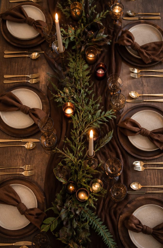
Chocolate brown tablecloths or runners change the whole feel of a reception space, and the way sources describe it, the effect is layered rather than flat.
Dark wood chargers beneath mocha linen napkins give each place a sense of depth that white-on-white simply does not achieve. Matte ceramic plates in ivory or amber keep the warmth going upward, while gold cutlery catches candlelight without turning theatrical.
The professional-grade approach that keeps coming up runs like this: oatmeal gauze or cocoa velvet runners over bare wood or stone tables, matte stoneware that reads as handmade pottery, brushed-gold chargers underneath, flatware in gold or black, amber glass goblets to echo the brown tones.
Tall brown taper candles make the palette feel rich rather than heavy; keep them non-negotiable for the warm glow they cast.
Copper accents sit well here, though they come up less often than gold pairings. Edison bulb installations and amber glass accents add depth in the same way candlelight does.
What I notice in comparing the recommendations is that the moody, draped-silk version of this look has started appearing for 2025, but the practical table-level advice stays consistent: textured runners, stoneware, gold flatware, brown candles.
The gap in what sources cover is real. They describe the finished look at rental or purchase quality, and they do not touch DIY alternatives.
If you are working with a linen company and a rental tableware package, the path is clear. If you are trying to approximate this with purchased or borrowed pieces, you are translating on your own.
Lighting for Warmth
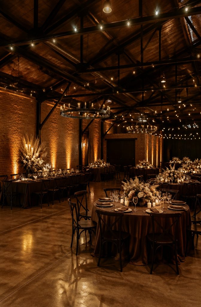
Brown absorbs light, which means a brown wedding color palette can sink into gloom under the wrong fixtures.
The fix is to plan a candle-heavy scheme from the start. Pillar clusters, floating tealights, and tinted hurricane sleeves all cast the amber glow that brings mocha or chocolate tones to life.
For venue walls, warm amber uplights instead of cool white keep the palette from reading muddy or flat; even a minimal LED setup can lift mocha linens into something dimensional.
Flash photography has become a huge trend for evening celebrations, and chocolate brown in particular thrives under it. The rich tones appear dimensional rather than flat, and brown avoids the shine that sometimes hits true black.
Warm tones soften the overall image while keeping crisp lines intact, which pairs well with the glowy, film-style aesthetic couples love right now.
The result reads nostalgic and modern at once, with depth that cooler palettes often lose once the flash fires.
Desserts That Match
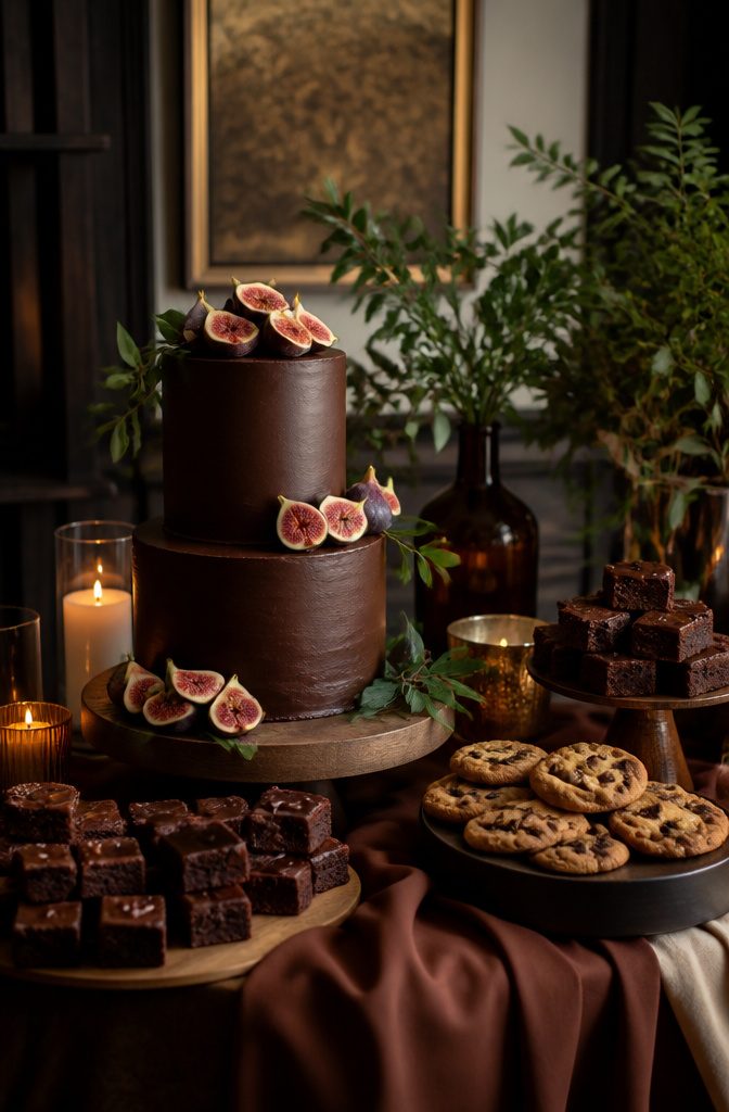
A chocolate wedding cake ties the palette together without trying too hard. The baker can run ganache between layers, hand-paint mocha florals on fondant, or leave the cake naked with a caramel drip and fresh figs on top.
Brownies and chocolate chip cookies on the side table keep guests moving through the night.
The bar deserves the same attention.
An espresso martini reads as brown in the glass and gives non-dessert people something thematic to hold. Brown sugar rims or edible gold flakes dress it up for photos without changing the drink.
For summer receptions, a gelato cart in chai-spice or brown-butter flavor hits the color note while actually cooling people down. Nut-based desserts, caramel drips, and coffee elements all thread through the same family of tones.
The risk is going too dark too many times: one showpiece cake plus one warm cocktail and a lighter finish like that gelato keeps the palate from feeling heavy.
Pairing Colors That Work
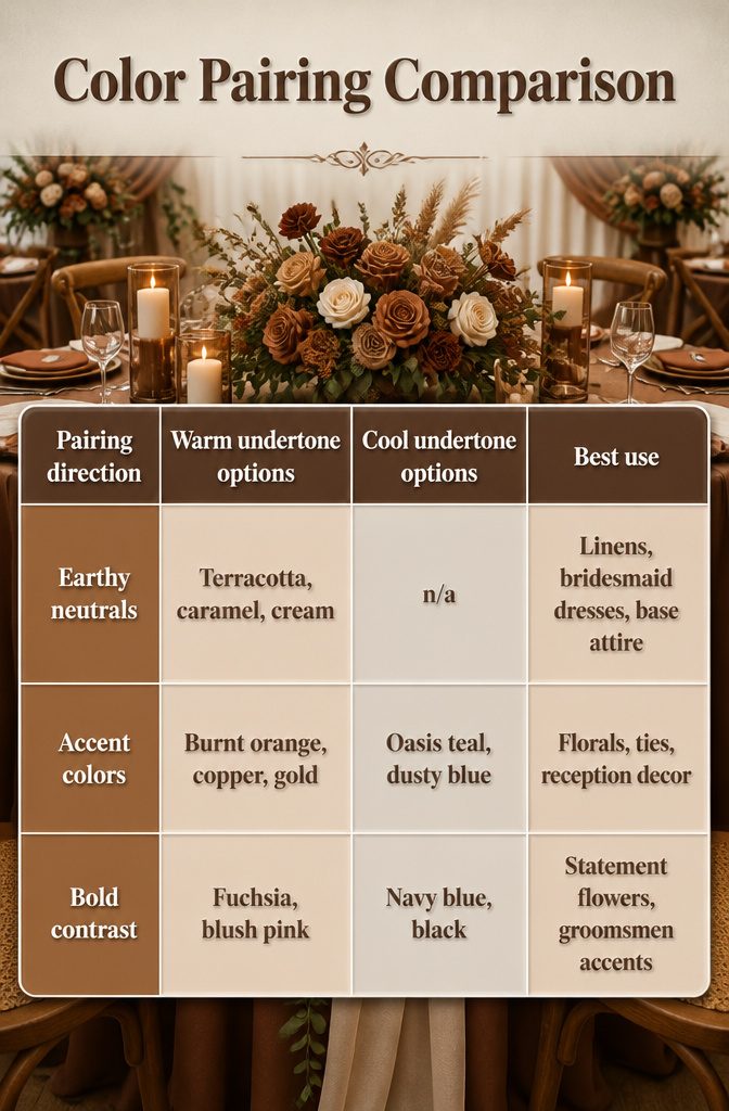
Warm browns and cool browns play by different rules, and mixing them is where palettes go flat. Pair warm chocolate with terracotta, caramel, cream, or sage and the whole room settles into the same register.
Rust, cinnamon, or copper ties keep a chocolate brown suit from looking like a rental afterthought. Cool browns, the taupe and ash families, need dusty blue, steel gray, or that teal called oasis to stay coherent.
The undertone rule matters more with brown than with navy or gray because brown sits so close to orange in the spectrum.
Warm terracotta napkins against cool taupe linens read as a mistake, not contrast. Decide which side your brown leans, then build from there.
| Pairing direction | Warm undertone options | Cool undertone options | Best use |
|---|---|---|---|
| Earthy neutrals | Terracotta, caramel, cream | n/a | Linens, bridesmaid dresses, base attire |
| Accent colors | Burnt orange, copper, gold | Oasis teal, dusty blue | Florals, ties, reception decor |
| Bold contrast | Fuchsia, blush pink | Navy blue, black | Statement flowers, groomsmen accents |
Burnt orange works as a near-neutral with light brown because both carry that same muted, leaf-litter warmth.
Fuchsia surprises more, yet it belongs squarely in summer: light brown dresses, fuchsia peonies and ranunculus, maybe a touch of purple or traditional pink to keep it from reading too sweet.
Black and navy blue both work, though black risks the cardboard-box effect unless you break it with cream, metallic pocket squares, or greenery.
Season by Season
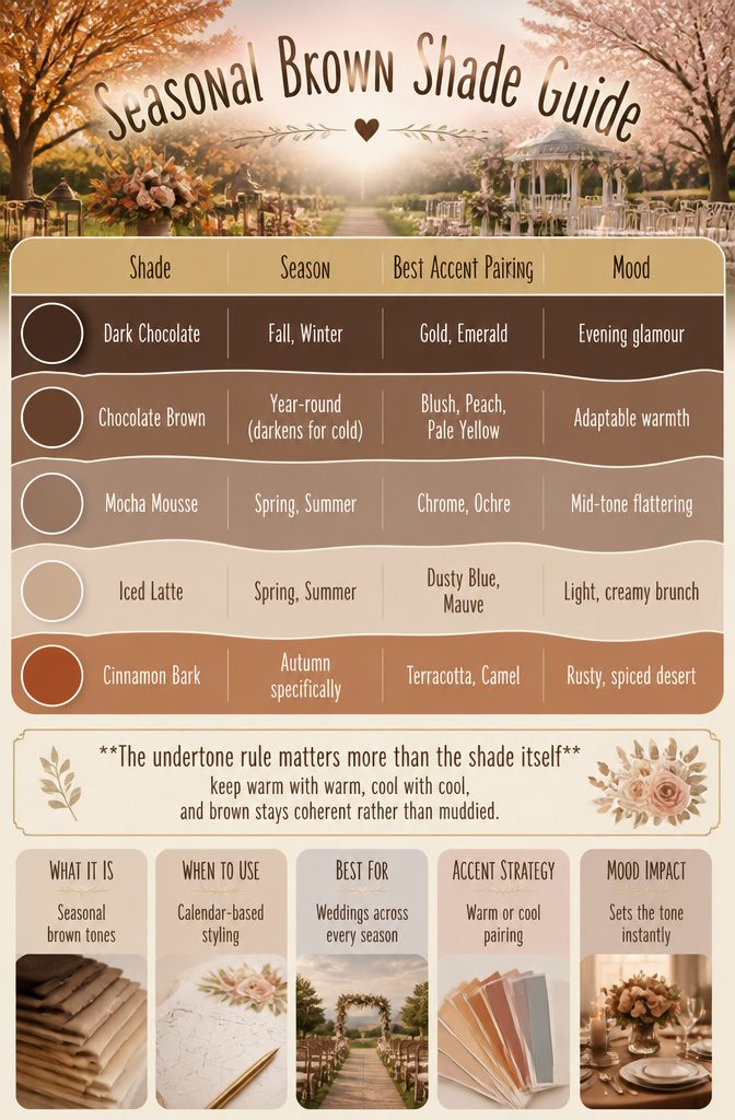
Brown shifts its weight with the calendar in a way few neutrals manage. Dark Chocolate and Chocolate Brown carry evening formality through fall and winter, while Mocha Mousse and Iced Latte open up for spring brunches and summer garden ceremonies.
Cinnamon Bark lands squarely in autumn territory with that rusty, spiced undertone that clicks against turning leaves.
The accent color does the seasonal heavy lifting.
Warm browns pair with ochre, terracotta, and camel for fall; cool browns lean into slate, mauve, and dusty blue for lighter months. Chocolate Brown specifically lightens against blush, peach, or pale yellow when the weather turns warm.
| Shade | Season | Best Accent Pairing | Mood |
|---|---|---|---|
| Dark Chocolate | Fall, Winter | Gold, Emerald | Evening glamour |
| Chocolate Brown | Year-round (darkens for cold) | Blush, Peach, Pale Yellow | Adaptable warmth |
| Mocha Mousse | Spring, Summer | Chrome, Ochre | Mid-tone flattering |
| Iced Latte | Spring, Summer | Dusty Blue, Mauve | Light, creamy brunch |
| Cinnamon Bark | Autumn specifically | Terracotta, Camel | Rusty, spiced desert |
The undertone rule matters more than the shade itself: keep warm with warm, cool with cool, and brown stays coherent rather than muddied.
What Brown Needs From You
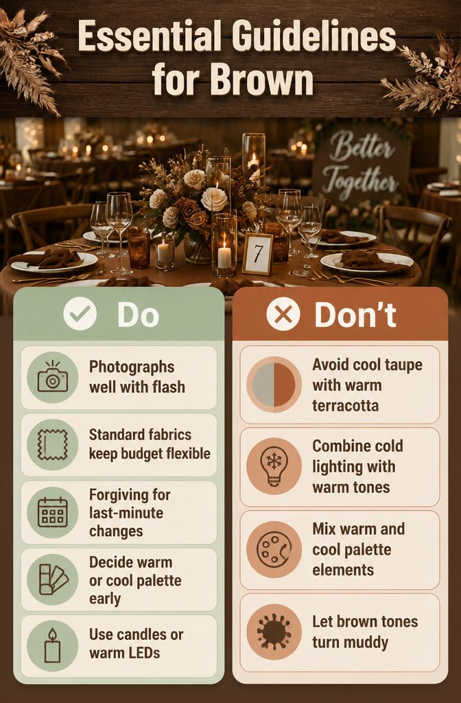
Flash photography has become a huge trend for weddings, especially evening celebrations or restaurant or downtown weddings with a chic party vibe.
Brown photographs well with flash because the rich tones appear dimensional rather than flat, avoiding the shine that sometimes hits true black while warm tones soften the overall image and maintain crisp lines.
The glowy, film-style aesthetic couples love right now pairs naturally with chocolate brown, giving photos a nostalgic yet modern feel.
Brown linens and suits are widely available and not premium-priced, which matters when every choice is a budget-versus-dream trade-off. Velvet and custom dye jobs cost more, so standard brown fabrics keep money in reserve for other priorities.
The color is also forgiving for last-minute changes. A missing napkin or a groomsmen swap is easier to absorb when the base shade is common and season-flexible.
One judgment call worth making early: decide if your palette runs warm or cool and stick to it.
Combining cool taupe linens with warm terracotta napkins reads visually off, and brown plus cold venue lighting turns muddy without candles or warm LEDs to compensate.
Frequently Asked Questions
Will brown look dated in 10 years?
Brown functions as a natural neutral, like black or white, so it will not timestamp your wedding photos the way a trendy pastel might.
The color alone carries no specific era as long as you avoid pairing it with period-specific accents. That staying power is part of why couples are moving toward brown wedding color palettes after years of brighter, more polished looks.
Can brown work for a beach wedding?
Yes, if you choose Iced Latte, the lightest shade in the family, and pair it with bleached shells and linen napkins.
The effect stays airy and coastal without falling into generic navy-and-coral territory. Add texture through natural accents so the palette reads intentional rather than like a default neutral.
Will brown clash with greenery?
Brown works fine with greenery if you stick to olive and sage tones and avoid anything with a neon cast or silvery blue eucalyptus that reads cold against warm browns.
Olive branches give an organic feel while keeping the look intentional, and sage stays soft enough for gentle brown palettes. The undertone match matters: warm browns want warm greens.
Is brown a good color for a wedding?
Brown works well because it offers warmth without demanding attention the way jewel tones do, and it photographs steadily across natural light and flash.
It flatters most skin tones in bridesmaid dresses and pairs easily with a wide range of metals, flowers, and seasonal accents. The color also tends to be widely available and not premium-priced compared to custom dyes or specialty fabrics.
What does a brown wedding color symbolize?
Brown carries associations of warmth, depth, and authenticity, a shift away from the bright, polished palettes of past years. It reads as lived-in and grounded rather than performative, delivering atmosphere without the kitsch of rustic themes.
For couples, that translates to a palette that feels comforting and elegant at once, closer to fine Cognac than to the harvest-gold appliances that once defined the color.
What are 5 shades of brown for weddings?
Dark Chocolate sits at the deepest edge, almost black in dim light and rich with candles.
Mocha Mousse is a mid-tone warm brown that flatters across seasons. Cinnamon Bark carries a rust undertone that catches autumn light.
Iced Latte is a creamy washed ivory at the lightest end. Taupe sits at the gray edge, the most formal and cool-toned of the family.
What are the wedding color themes for 2026?
Brown palettes are moving to the center for 2026, with Pantone’s Mocha Mousse leading the shift toward earthy neutrals that feel intentional rather than accidental.
The 2025 "Earthy Neutrals" Pinterest trend continues into layered tablescapes with velvet or gauze runners, matte stoneware, and tall brown taper candles.
Warm undertones dominate for fall and winter, while lighter browns like Iced Latte open up for spring and summer garden ceremonies.