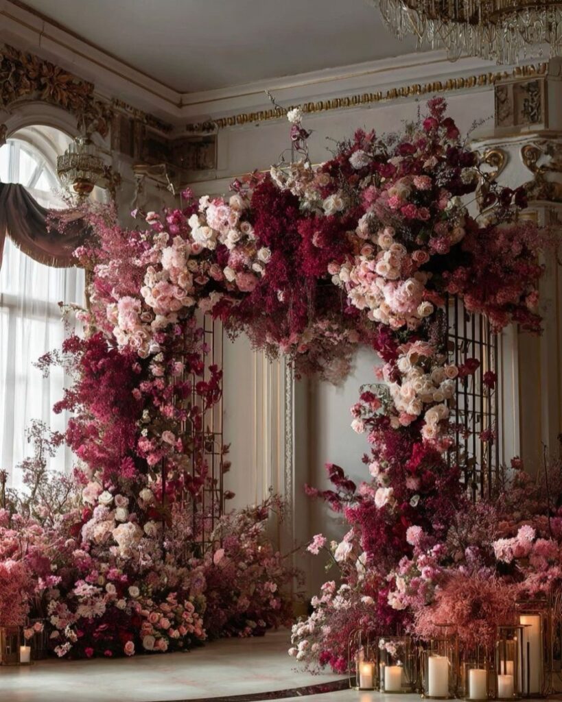
A burgundy and blush wedding can lean spare with satin tablecloths and potted aisle greenery or go full drama with draped ceilings and moody roses.
This pairing comes alive in cooler months, when the warmth feels natural rather than forced. Dusty rose and mauve fill the gap between the 2 main colors so the palette shifts gradually instead of dropping straight from dark to light.
[link-whisper-related-posts]1. Burgundy and Blush Palette
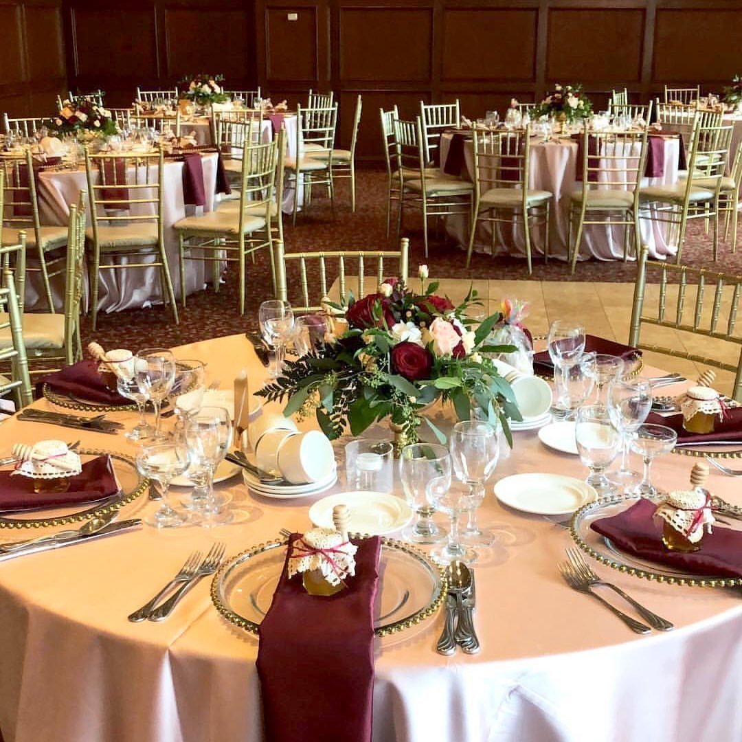
Burgundy and blush together make a palette that reads as intentional rather than accidental because the 2 colors share a red undertone. Deep wine red brings weight and warmth; soft pale pink keeps the room from feeling heavy.
I like that this combination works across seasons, though in summer I would pull the balance toward blush, and in late fall I would let burgundy take more space.
The specific shades that sit well between them are dusty rose at #C9948A, mauve at #B48A9D, and a warm cream at #FAF7F2.
These middle tones keep the jump from dark to light from looking like 2 palettes colliding. Rose gold metal finishes bridge the same gap for flatware, candlesticks, or chair frames.
A warning I picked up from budget breakdowns: this palette tempts couples toward velvet, heavy linen, and fresh roses in quantity.
Each of those choices is expensive. Satin tablecloths in blush give the same color presence at a lower cost per table than velvet would.

Premium Material: Softalker tablecloths are made of 100% premium microfiber fabric, soft, durable, and designed for long-lasting use. Perfect for protecting and decorating your dining table.

Flame Retardant Excellence: Crafted with IFR (Inherently Flame Retardant) polyester, our tablecloth ensures safety without compromising style, making it perfect for events, weddings, and restaurants.

2. Mismatched Burgundy and Blush Table Settings
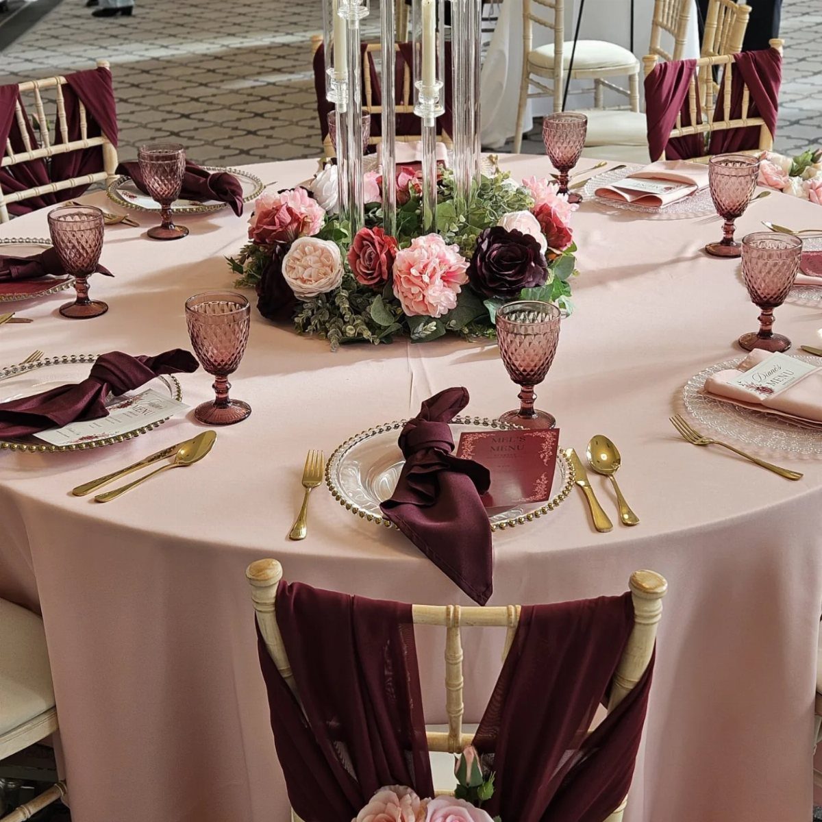
Mismatched table settings suit couples who want the reception to feel gathered rather than rented.
Alternating burgundy and blush napkins against a blush cloth base, with beaded chargers and colored goblets at each place, keeps the eye moving across the table.
That variation is enough to keep the eye moving without making the table look unfinished.
The base linen matters more than I expected when I first planned table decor. Cream or ivory works better here than pure white, which can read cold against the warmth of burgundy.
For the strongest single impact at the lowest added cost, a burgundy velvet table runner over a plain cloth changes the whole table’s presence.
What to avoid: chrome or silver charger plates.
The cool tone fights the depth of this palette. Antique gold or brushed brass chargers cost about the same from rental companies and keep everything in the same warm family.
Burgundy taper candles in brass candlesticks extend the color upward; cream or blush pillar candles fill space lower down without adding another strong hue.

【Burgundy Bridal Shower Decorations】:The floral party supplies include 50 9"" floral bridal shower plates, 50 7"burgundy floral plates, 50 9oz floral paper cups,50 burgundy floral napkins. You can serve 50 guests at the same time.This is a great bridal shower paper plates and napkins

Burgundy Party Supplies for 24 Guests: This 121-piece burgundy party supplies set includes 24 x 9" dinner plates, 24 x 7" dessert plates, 24 paper cups, 24 napkins, 24 forks, and 1 tablecloths. Featuring a coordinated gradient palette from blush pink and rose pink to dusty rose and burgundy, this paper plates and napkins set makes it easy to create an elegant and cohesive table setting for up to 24 guests

Event Ready Table Presentation - A set of 24 cloth napkins that brings a polished look to your dining table. Designed as classic dinner napkins, they upgrade everyday meals and special gatherings in a way guests notice the moment they sit down.
3. Burgundy Roses and Blush Roses
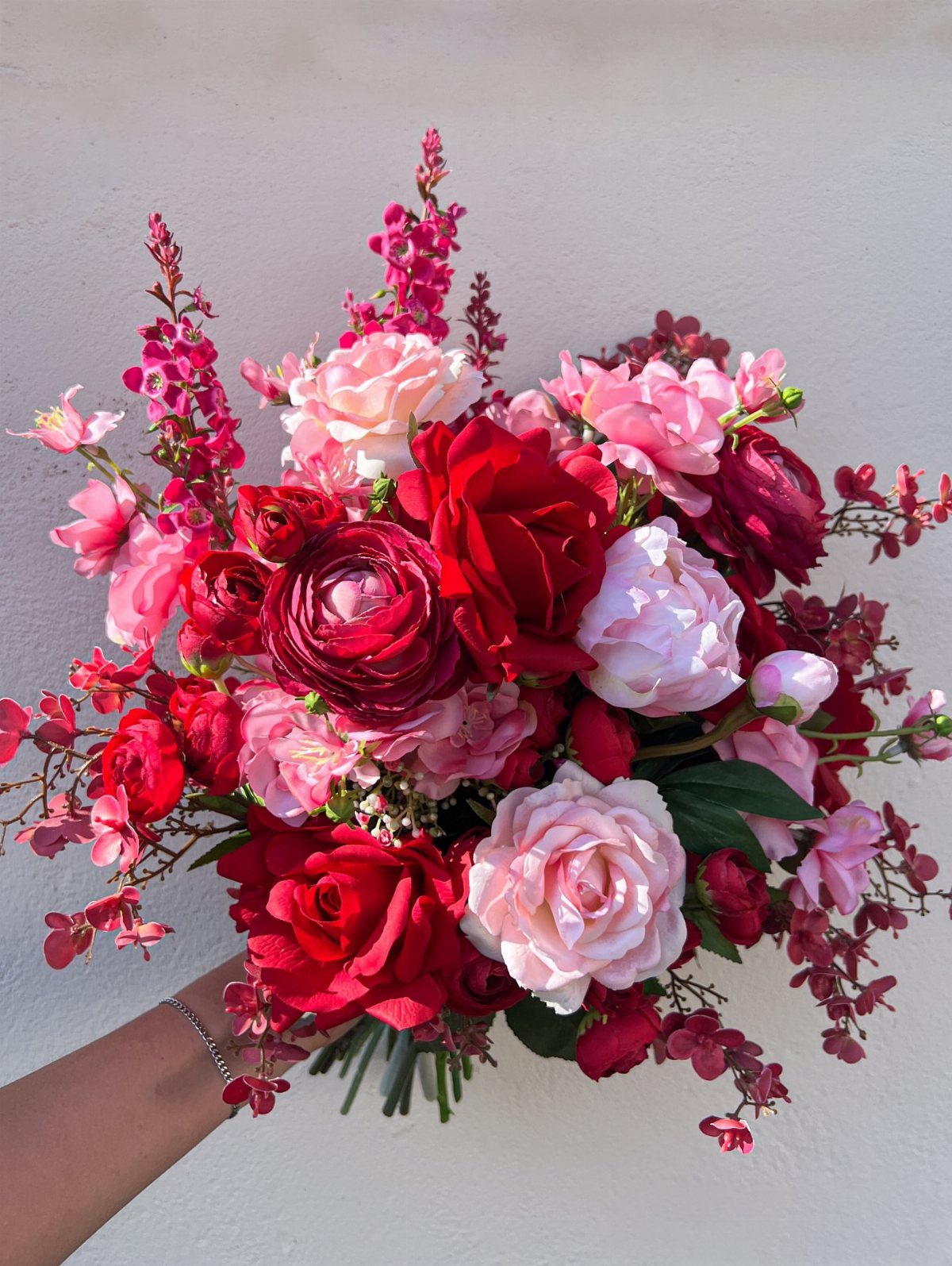
Burgundy roses carry a heavier symbolic weight than most wedding flowers, and blush roses soften that intensity without canceling it.
Mixing deep red, burgundy, and pale pink blooms against a plain background is how I would want to see the combination tested: simple setting, no competing colors.
Before committing, check whether your date falls in a season when both colors are available fresh.
Burgundy roses deepen in tone as they open; blush roses lighten. Ordering both at the same stage of ripeness means asking your florist to time the delivery, or accepting that the contrast will shift slightly over the wedding day.
If fresh burgundy or blush roses are not available, or if allergies rule out strong-scented varieties, silk flowers have improved to where the difference is not visible in photographs.
Peonies substitute well for blush roses in spring; for burgundy, calla lilies hold the same depth with a different shape.

Vintage-Elegant Décor: Luxurious textures and rich colors enhance your dining experience and provide a touch of vintage ambiance to your table decor with our velvet table runners, perfect for any occasion.


4. Burgundy and Blush Bridesmaid Dresses
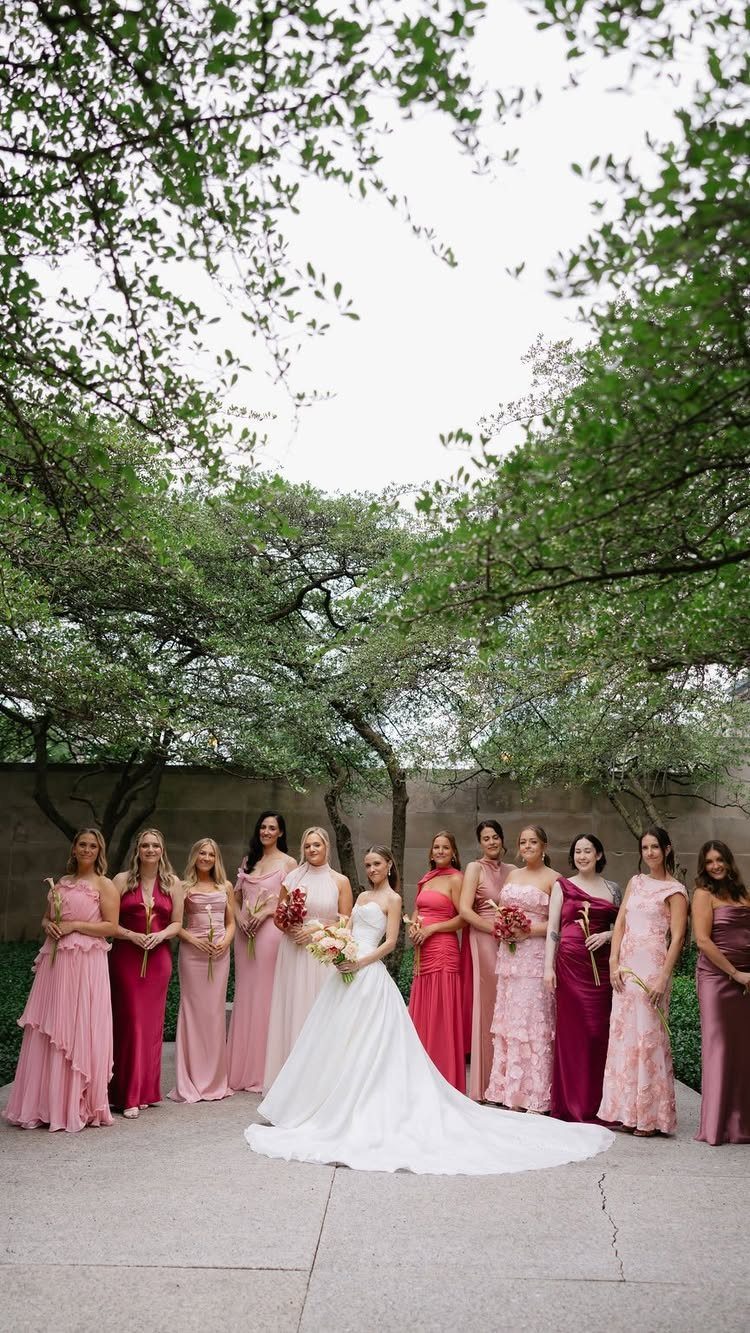
A large party in varied shades creates a gradient effect that photographs well because the eye finds each woman individually instead of reading the group as a single block of color.
The bride in white then becomes the clear center without anyone needing to match her exactly.
All blush dresses produce a softer, more romantic bridal party; all burgundy reads as more formal and more dramatic.
I would choose the mixed approach for an outdoor or garden wedding, where the green background needs the color range to keep the party from disappearing.
For an evening reception in a dim hall, all burgundy holds its presence better under low light.
Dusty rose and mauve sit between the 2 main colors and let you include more bridesmaids without repeating exact shades. Some dresses read as pink, some as near-red, and the group still looks planned rather than random.

Choose this special burgundy pink flowers as your wedding or party decoration! There is a good variety of tonal flowers in different sizes, unique and beautiful, the large size burgundy roses will catch the eyes of guests easily

❤️【Styled for Easy Decorating】We put together this artificial flowers set so you can create a finished look without much effort. The mix of burgundy, blush floral, peach, ivory, pink and red flowers works beautifully in vases, centerpieces, baskets, and seasonal displays.

VERSATILITY: Ling's artificial flowers offer ideal for a range of projects, particularly wedding decorations, options beyond seasons, florists and designers can save flowers sampling on budget by our comprehensive flowers in colors, sizes, and floral types. Use them to create captivating centerpieces, bouquets, wedding arches, and other decor elements to elevate any venue.
5. White Cake with Burgundy and Blush Florals
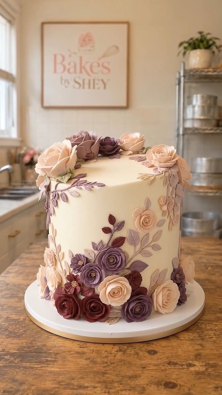
A white cake with burgundy and blush sugar flowers keeps the dessert from competing with the floral arrangements around the room.
This white cake keeps decoration minimal—no elaborate tiers or sculptural flourishes—because the flowers carry the color statement, not the cake’s shape or height.
For a smaller guest count, the single-tier white base with clustered florals gives you the same palette presence without the extra cost of additional cake layers.
Gold leaf is another finish to consider if you want a metallic accent that does not compete with the florals.
It adds warmth without introducing a third color, and it catches candlelight at a reception. A baker can apply it to a white or blush tier in small patches; full coverage reads as more modern than this palette usually wants.

CLASSICAL DESIGN: This 13" gold plate chargers are made of high-quality plastic, with a distressed design and decorative antique embossed around rims, which create a classic antique look, ideal selection for vintage enthusiasts.

【Size and Material】 Measures 13", made of plastic,this charger plate features an antique Gold color accented with distressed markings and embossed edges.

Premium Material & Precise Specification: This charger plates set of 12 is crafted from durable plastic, finished in a vintage antique gold tone. Each gold charger plates measures 13 inches in diameter, designed for decorative use, not for direct food contact, and is not microwave or dishwasher safe
6. Bouquet Ideas
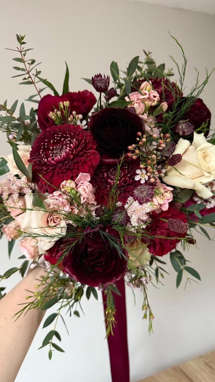
Deep burgundy ranunculus and dahlias packed against blush carnations and cream roses, with greenery and a long dark ribbon, give the bouquet weight at the center and movement at the edges.
That combination works because the shapes differ enough to keep the 2 main colors from flattening into each other. Dahlias hold their structure; carnations soften around them.
For the richest version of this palette, I would ask a florist for Black Baccara roses as the burgundy anchor, blush peonies for volume, and dusty rose ranunculus to bridge the two.
Eucalyptus or olive branch keeps the green neutral enough that it does not become a third competing color. Dried pampas grass wisps add texture without adding hue.
A trailing ribbon in burgundy or mauve extends the bouquet’s vertical line and photographs well in motion, during the walk down the aisle or the first dance. It is a small addition that changes how the bouquet reads in video.

SIZED FOR 6 FOOT FITTED TABLE: This 72 x 30-inch tablecloth, featuring hemmed edges and seamless construction, perfectly sized for a 6-foot rectangular table, providing a full-length fitted 30-inch drop Its sleek design complements any tableware and décor.

Premium Fabric: Table cloth is made of wrinkle resistant table cover with 90% polyester and 16% spandex fabric.The fabric is soft,and innovative suture technology at the footpoint of the table.Wrinkle-resistant,stain-resistant,and highly stretchy

SIZED FOR 6 FOOT TABLE: Measuring 60 x 102 inches, this elegant tablecloth with hemmed edges and seamless construction is perfectly sized for a 6-foot rectangular table, providing a 15-inch drop. Its sleek design complements any tableware and décor.
7. Ceremony Aisle Floral Arrangements
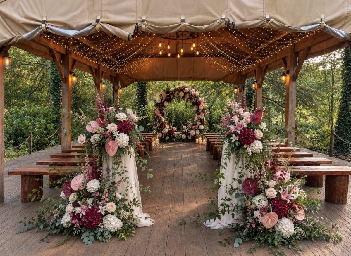
Ceremony aisle arrangements mark the transition from guest to participant, and burgundy with blush does this with more gravity than an all-white aisle. 2 anchored arrangements at the aisle entrance keep flower costs in check while still marking the walk.
Dark burgundy roses or dahlias anchor the color story; blush peonies or ranunculus keep it from going heavy. Eucalyptus and olive branch fill the green role without introducing a cooler tone.
I would ask the florist to keep the blush elements at face height or above, since lower pink blooms can read as scattered petals before the bride reaches them.
For a budget alternative, potted greenery with a single burgundy ribbon tie at each row end carries the same color direction with rental plants you return the next day.

Durable and Long Lasting: Our Cloth Napkins are made with Cotton Enrich Fabric which is Soft, Absorbent, Durable, Wrinkle, and Fade Resistant. These Waterspout Dinner Napkins will certainly Bring lovely charm to your dining experience with a light but cozy feel on your Dinning table.

Value Pack – The 12-pack provides you with enough dinner napkins for all your household needs for today, tomorrow; and the future. With the perfect size of 18 x 18 Inches, anyone can handle these napkins with ease.

SMOOTH SATIN NAPKINS: Satin cloth napkins are made of high-quality 100 percent polyester (satin fabric). Silky satin napkins has a smooth touch with charming and shiny colors, you can fold out various shapes according to your ideas. Machine washable, reusable, not easy to wrinkle and fade.
8. Draped Wedding Stage Setup
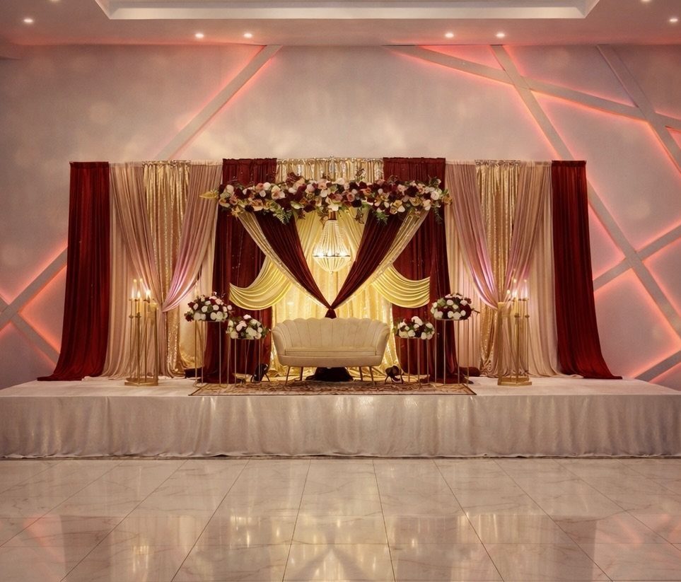
A draped stage works best in venues that already have warmth in their bones: barn wood, stone, or paneled walls.
Blush and burgundy drapery needs a neutral ground to work; against bright white walls it reads as decoration rather than structure.
The tufted white loveseat is the visual anchor that lets the drapes stay busy without overwhelming.
Before committing, check whether your venue allows ceiling rigging for the fabric; some historic spaces restrict what can be hung. If rigging is limited, a pipe-and-drape frame behind the stage gives the same layered effect without touching the building.
For a lower-cost version, eucalyptus garlands with intermittent blush roses carry the same shape with fewer blooms.

MATERIAL: The table runner is made of high quality velvet, soft and smooth, not easy to wrinkle and shrink, no pilling and fading, no peculiar smell. Excellent wrinkle resistance, elasticity and dimensional stability.

3D Bow Craftsmanship for an Instantly Elegant Look: featuring oversized 3D sculpted bows at both ends, this velvet table runner adds a luxurious, photo worthy centerpiece to any dining setting; No fluffing or styling needed simply lay it flat and your table is transformed

High Quality & Durable : Made of 100% spun polyester, sturdy sewing, soft and durable, protecting your table's surface from hot pans, scratches, and spills
9. Burgundy Draped Reception Hall
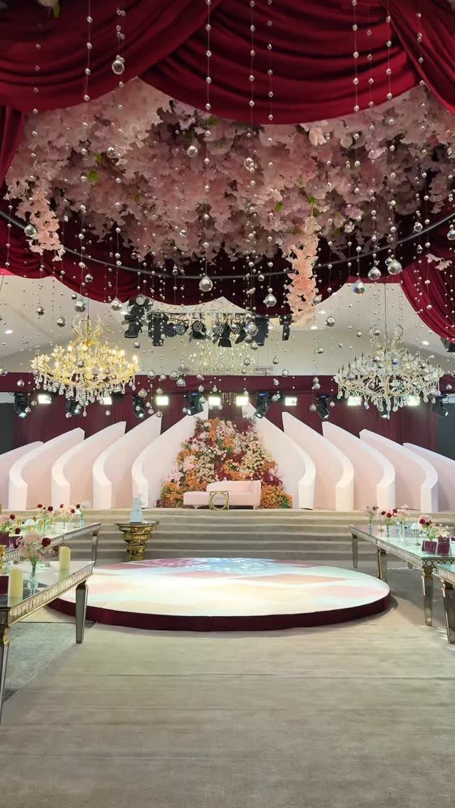
Ceiling draping in burgundy changes a plain reception hall into a room that feels finished before any guest sits down. An overhead installation in soft pink draws the eye up so the table settings are not doing all the work.
This scale of draping requires a rigging plan from the venue or a rental company with ceiling access experience.
Crystal chandeliers already cast warm light; burgundy tapers on every table would tip the room darker than this look wants. I would use cream pillar candles instead, and reserve the burgundy candles for spaces with less inherent drama.
The white arches on stage echo the loveseat from the earlier stage entry. Repeating that clean white element against the deep draping keeps the room from feeling like a wine cellar.

Design Inspiration: Capture the serenity and happiness of romantic love with blush and cream decor

Size and Material: This Garisey handcrafted rose flower garland is 5 feet long and made of high-quality foam and silk.The rose leaves have a real texture.

🌹 Package Include: 50 pcs burgundy fake roses with long stems. Pot not include. The roses stem height is 20.1 inches. Bendable wire stems allow easy shaping to fit vases, bouquets, garlands or craft projects. Customize your decor without worrying about wilting or breakage.
10. Floral Centerpiece with Ribbons
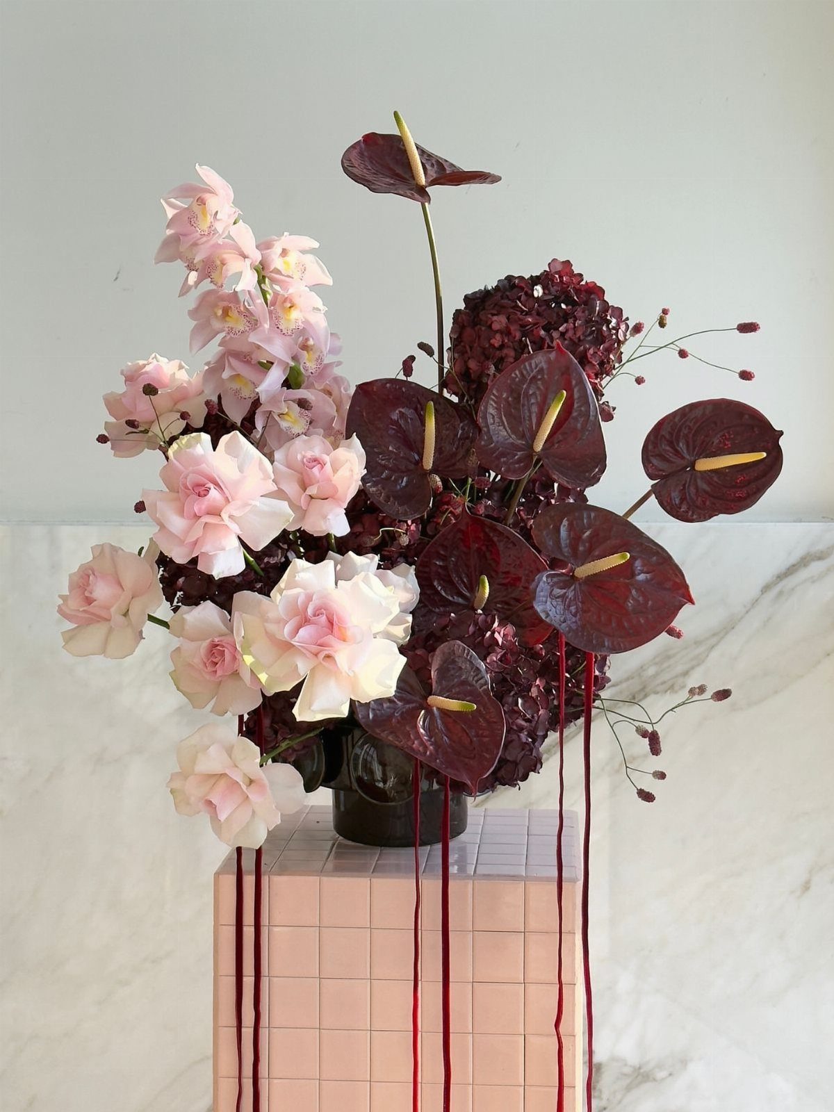
A dark vase does the work of grounding pale blooms so they do not float away visually. Burgundy anthuriums have a waxy, almost sculptural surface that plays modern against softer roses and hydrangeas.
Trailing ribbons extend the arrangement downward and catch air when guests move past.
Thin ribbon moves better than wide satin; it tangles less and photographs as a line rather than a flag. I would tie the ribbon at the stems, not drape it inside the vase where water darkens the color.
For a winter reception, this centerpiece suits a table with burgundy velvet runners and cream linen. In summer, the same flowers in a lighter ceramic vessel with shorter ribbon tails keeps the palette from feeling heavy.

Sufficient Quantity of Charging Plates: the package contains 12 antique gold plates, with a quantity sufficient to meet your daily use and replacement needs; Their generous and elegant appearance adds more charm to your dining table

Package includes set of 12 gold charger plates, each plate measures about 13 inches in diameter. The chargers for dinner plates simply wipes clean with water and wiped with a dry cloth. It is not suitable for microwave or dishwasher use. No direct food contact.

Great Value: Including 12 pack gold charger plates. Diameter is 13 inch, inner diameter: 9". They're large enough to accommodate small to regular-sized plates and serving bowls
Color Harmony
Burgundy carries a purple shift that pure red cannot match; that blue-leaning undertone keeps it from reading aggressive. Blush sits at the opposite extreme of saturation, nearly white with only a whisper of pink.
What ties them is hue: both spring from the same red-pink root, so the eye reads them as kin rather than opposites. The contrast is in value and saturation, not in color family.
Seasonal Themes
September through November is where burgundy and blush feel most natural together, the months when the colors already exist outside the venue windows.
Winter carries the same weight. Spring tilts the same pairing toward blush, and the combination still holds.
Summer is the hardest season to make this work; the warmth of both colors fights against heat and bright sun, and I would move the balance far toward blush or choose a different palette entirely.
A couple planning an outdoor July wedding should know this pairing takes more effort in summer than in October, and the budget for flowers and draping to make it feel intentional will run higher.
Photography Considerations
Warm light is where this palette pays off in photographs. Candlelight deepens burgundy and turns blush amber, which flatters both colors without much effort from the photographer.
Late afternoon sun does something similar, lighting dark flowers from behind and catching pale ones in pink-gold. Overcast days keep their own advantage: blush stays delicate instead of blowing out, and burgundy avoids reading as black.
Film or film-emulation processing adds a nostalgic warmth that flatters both colors.
The result reads editorial or vintage-album, depending on the rest of the styling. I would not choose this processing for a crisp, modern venue; it suits barn wood, worn stone, or any space that already carries time in its surfaces.
Mixing Tones
The middle tones do more than fill space between 2 extremes. Dusty rose and mauve add depth that a straight dark-to-light jump cannot achieve on its own; the eye travels through the palette instead of snapping between 2 poles.
The practical effect is that you can place more elements in the room without repeating the same 2 shades until they tire.
The family relationship holds because every tone shares that red-pink base; saturation and value shift, but the hue does not.
Frequently Asked Questions
Do blush and burgundy go together?
They share the same red-pink base, so the eye reads them as kin rather than opposites. At #C9948A and #B48A9D, dusty rose and mauve step into the gap between them and tighten the link.
What color compliments burgundy for a wedding?
Blush is the natural partner because both colors spring from the same red-pink root. Rose gold flatware or candlesticks cross the same distance with metal, and warm cream at #FAF7F2 grounds the pair more gently than stark white.
What flowers are best for burgundy and blush?
Black Baccara roses hold the dark end, blush peonies give the arrangement its body, and dusty rose ranunculus sit between. Eucalyptus or olive branch keeps the green neutral, and dried pampas grass adds texture without adding hue.